Tuesday, 22 December 2015

Selecting a Music Genre

There is an incredibly large variety of music genres, some of which are aimed at a more niche market, whereas others are targeted at the majority. For example, post-punk revival (a sub-genre of Indie music) has a smaller and more selective audience, but on the other hand Pop interests almost everybody. This simply shows the diversity within the industry, which in turn affects media products such as magazines. Below I have written a somewhat brief description of my chosen music magazine genre, I personally enjoy this type of music which is important that I'm kind of educated and informed about it. Furthermore, I appreciate that it is not a genre with as big an audience as a genre like Pop, but also realise it's popularity with the younger generation who will therefore be my target audience.

Alternative/Indie Rock: Despite the common misconception of the two genres being perceived as different; the words are in fact interchangeable with one minor dissimilarity. This is that the term "indie" was for the most part associated with British-based music, whilst "alternative" was used for American.

Indie rock originated from the 1980's in the UK and has since grown a rather large audience as a result of it being a successful and illustrious genre. In addition to that there are many sub-genres which include: Britpop, Dream Pop, Indie Pop, Post-Punk Revival, as well as Post-Rock.

Alternative rock (also known as alternative music, alt-rock, or simply just alternative) derived from the independent music underground which became well known in the 1990's and 2000's. Sub-genres of alternative rock include: Grunge, Gothic Rock, Jangle Rock, Geek Rock, Paisley Underground, Neo-Psychedelia, College Rock, and Noise Rock. Alternative music also shares many of the sub-genres that belong to Indie music.

Indie Rock Artists Include: Nirvana, The Killers, Arctic Monkeys, Oasis, Florence + the Machine, Coldplay, Catfish and the Bottlemen, Kings of Leon, Bastille, Lana Del Rey, and M83.

Alternative Rock Artists Include: Nirvana, The Killers, Arctic Monkeys, Oasis, Coldplay, Catfish and the Bottlemen, Green Day, Red Hot Chili Peppers, Foo Fighters, Imagine Dragons, Muse, Fall Out Boy, U2, and Nothing But Thieves.


Features of Alternative/Indie Rock Magazines: After analysing and observing many music magazines I have gained an understanding of popular characteristics with magazines of certain genres. For instance, popular music magazines that also feature Hip Hop, Dance, R "n" B and so on tend to have vibrant colours against simple backgrounds with a minimal colour palette. This exaggerates the vibrancy of the tones which can lead to a really eye-catching cover and also emphasise certain topics on the magazine; this is a very effective technique which I have seen being used by publishers like Q, Rolling Stone, Billboard and Vibe.

Image result for q magazineImage result for vibe magazine
- Anchorage text (this is where the artist on the cover's name is in a large text that is typically placed on top of them) is once again a very popular feature, which can be seen in the Q, Rolling Stone and Billboard covers above. 
- Skylines also allow for bonus information that doesn't need to take up a lot of space to have a place on the cover. Creating a clean and organised appearance skylines can be subtle but advantageous. 
- Generally music magazines appear to have a red, black and white accent, which can be seen above in all of the examples. This is a result of the colour popping off the simplistic colours, for example Minaj on the cover of Vibe really stands out due to her bright orange hair, which draws in potential readers, against the white background.
- Finally a bold masthead is very popular within the production of music magazines; whilst the entire title does not need to be on show it most certainly adds something to the magazine. Although some of the mastheads above are partially hidden because of how well known they are, meaning that an individual should recognise it despite the missing letters, doing this allows for more room but also for the main focus to be on the artist. At the end of the day this is the publisher's objective simply because fans will be attracted by the artist, buy it and contribute to the company's ever growing profit.
Thursday, 17 December 2015

Analysis of Second Music Magazine Cover: Rolling Stone

Rolling Stone (RS) is a biweekly magazine that focuses on popular culture, but is mostly known for it's musical reportage. With it's first issue being published 48 years ago in 1967, the universal magazine mainly focuses on popular culture. 

Although this particular issue is in French, a language which I do not comprehend, and will not be able to analyse the language; I like the cover as a result of it's originality. Jimi Hendrix on the cover alone would capture anybody's eye, but the appropriate use of the colour blue also creates a refreshingly new appearance that would attract any potential reader.

Masthead: Whilst the masthead is partially hidden by Hendrix it ensures that the main focus stays on the artist as he draws in the audience. However, RS is an exceptionally well known magazine across the globe so there really is no need for the full masthead to be on show. To somebody who is unaware of the magazines popularity and history the placement of the masthead may suggest that it is a very successful magazine and is easily recogniseable by most.

Main Cover Line: Altogether, the font follows a rather formal style which may propose that the typical reader is not particularly young nor old. Furthermore, the fact that Hendrix is on the cover is likely to be a consequence of him standing for much more than just an icon in the music industry. So, this issue is highly likely to be aimed at somebody who listened to his music whilst he was still present in the world of music.

The contrasting white pops against the various tones of blue which allows for the message to be received and understood clearly. Due to the audience possibly being of  middle age the main interest would be in the articles not necessarily the appearance. Obviously, the image is still relevant but I think its not a stretch from the imagination to say that a younger audience would focus more on the appearance compared to that of a slightly older audience.

Main Cover Image: Without creating a sense of intimidation, Hendrix is possessing a powerful stance and looking into the camera lens. This draws a direct and meaningful image which also allows for the reader to be put on a personal level with the blues artist. Moreover, the cigarette and military styled jacket reflects the counterculture movement in the 1960's, when Hendrix was singing, producing music and performing at festivals. 


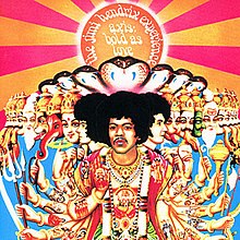
 A color photograph of the Experience painted in Hindustani styleA black and white photograph of three men, one is sitting on the floor.A color image of three men standing together wearing psychedelic clothing.

Sunday, 13 December 2015

Media Ideologies: Audience Theory

Audience theory is the study of those who may invest their money and/or time in the product, in order to make it successful with the target group.
The theory includes 3 separate ideals:
- The Effects Model or the Hypodermic Model.
- The Uses and Gratifications Model.
- Reception Theory.


The Effects Model
This particular theory suggests that the audience are somewhat helpless and submissive when it comes to preventing the influence that is made by the consumption of media texts. Therefore, these products within the media create an effect on the audience even though they have no power over how it has impacted them. With saying that the power ultimately lies within the message of the text. Overall, the intended message is directly welcomed and completely accepted by the receiver without any judgement.

Although the Hypodermic model is very similar, if not the same, as the one above there are a few differences. Once again the audience is powerless to resist the messages that are in media texts but in this theory it's believed that the audience become almost drugged in the sense that they are addicted. Evidence of this includes a theory that the Frankfurt School came up with in the 1920's and 30's, rather than the audience controlling the media which follows a more logical ideal it's the other way round. So, the institution speculated that the mass media acted to restrict and control audiences to the benefit of corporate capitalism and governments.


The Uses and Gratifications Model
When comparing the previous theories with the uses and gratifications model they are evidently far from being the same. As opposed to being controlled by the media texts and not used by it the audience has the power by being active. Rather than the audience being "drugged" by the media the audience has the ability to freely reject and use the product as they wish.

Audiences therefore use media texts to satisfy needs for:
- Comparing relationships and lifestyles with one's own.
- Diversion.
- Escapism.
- Information.
- Pleasure.
- Sexual stimulation.

Actively making the choice enables the viewer to receive something from the media text which is more than pleasure, in fact the consumption of these chosen texts can help individuals to improve their personal issues. Ranging from learning; emotional satisfaction; relaxation; help with issues of personal identity; help with issues of social identity; and to help with issues of aggression and violence.


Reception Theory
Although the previous theories are believed to be somewhat controversial and have their limitations, a different approach to audiences was developed by Stuart Hall at Birmingham University in the 1970's. The theory considers how texts are encoded with meaning by producers and then decoded by the audience, Essentially, this means that the producers put in a meaning which they want the audience to infer, this may resort to different interpretations but can also lead to the particular message that was conveyed being understood.

Hall furthered his theory by developing distinguishing three versions of audience decoding:

Dominant or Preferred - This involves the viewer interpreting the media text as the producer had intended and mostly agreeing with the message.

Negotiated - Taking a more neutral stand, the audience are neither for or against the topic of which is being discussed.

Oppositional - In this case the dominant message is acknowledged although it is dismissed on religious, political, cultural or ideological grounds.


Producer = Dominant or preferred
Encodes = Negotiated
Meaning = Oppositional

Friday, 11 December 2015

Vibe Music Magazine Contents Page Analysis

Founded in 1993 by Quincy Jones, Vibe is a music and entertainment magazine that mainly covers R&B as well as Hip Hop music. The American magazine is targeted at a mostly young, urban audience who are interested in hip-hop culture. As of 2014 the magazine moved to an online version.

Image result for magazine contents page

Contents Masthead: Placed on the left side of the page in a rather unconventional layout, the title stands out due to it's originality. Having said that it also complements the image, of Kanye West, so that it becomes the main focus point. With the masthead being in a large, bold font it draws the viewer's eye to the title which ensures that they know what the page consists of.

Main Image: The contents page is for the most part covered by a photo of Kanye West. Despite this possibly being seen as a negative thing, because it only shows him and no other article features, West is an iconic rapper, music producer, fashion designer and is just generally well known in the media. Therefore, this may lead to a larger audience than usual who want to read the instalment of Vibe.

The page in itself is predominantly grey, as a result of this the viewer is drawn to the bold red heart upon West's chest; covered by a woman's hand which infers that the article on him goes over his personal life. Furthermore, one can interpret this as somebody owning his heart which may interest his fans who can learn more about his life. Despite the fact that the background is acceptionally plain, the "V" behind the musician still reflects what the magazine is as a result of the letter being like a trademark.

Contents List: The contents has been subtly placed on the left side of the page below the masthead, which has been written a different font to the masthead. Whilst this juxtaposition makes for a more visually interesting design it also differentiates the features.

Opinion

Overall, the cover remains visually interesting regardless of it's simplicity. Although, many would prefer a more busy design I find it to be somewhat original. Plus the photo of West speaks for itself with the use of the audience needing to read between the lines, I would like my music magazine to reflect this.

Thursday, 10 December 2015

Music Magazine Questionnaire

1. Do you listen to music?     YES          NO

2. Do you read magazines?     YES          NO     (If YES answer 2a, if NO go to question 3)

2a. Do you read music magazines?     YES         NO     (If YES answer 2b, if NO go to question 3)

2b. How many music magazines do you read in one month?     ..................

3. What is your favourite genre of music? (Tick up to 3)
               Pop                    Rock                         Classical                    African
               Hip Hop            Indie                          Opera                        Asian
               R "n" B             Alternative                 Jazz                          Latin
               Rap                   Heavy Metal               Blues                       Folk
               Dubstep            Trap                            Soul                         Avant-Garde
               House                Techno                       Country                   Comedy
               Electronic          Dance                         Easy Listening        Carribean and Carribean                                                                                                                       Influenced
               Other, please specify...................................................................................
                                                 ...................................................................................
                                                 ...................................................................................

4. Who is your favourite music artist? (Tick up to 3)
     Adele                    Sam Smith                    Macklemore                    Coldplay
     Justin Beiber         Ellie Goulding              Fall Out Boy                   Catfish and the Bottlemen
     Jess Glynne           Naught Boy                  Chris Brown                    Taylor Swift
     The Weeknd          Rudimental                   Eminem                           Ed Sheeran
     One Direction        Calvin Harris               Drake                                Rihanna
     Other, please specify...................................................................................
                                                 ...................................................................................
                                                 ...................................................................................

5. What would make you pick up and want to read a music magazine? (Going by the cover)
    Please list: .............................................................................................................................................
                      .............................................................................................................................................
                      .............................................................................................................................................

6. Would you read a music magazine if it featured some of the qualities you have listed above?
                    YES, why?  ...........................................................................................................................
                                           .......................................................................................................................
                                           ........................................................................................................................

                    NO, why?  ...........................................................................................................................
                                           .......................................................................................................................
                                           ........................................................................................................................

7. What would be the maximum price you would spend on a music magazine?     £................

8. Would you pick up a music magazine even if it did not feature an artist you like? Going by the other artists on the cover, colour, a genre of music that you liked being featured, design etc.
                    YES, why?  ...........................................................................................................................
                                           .......................................................................................................................
                                           ........................................................................................................................

                    NO, why?  ...........................................................................................................................
                                           .......................................................................................................................
                                           ........................................................................................................................

9. Do you prefer a minimalist or busy design on a cover?
                    MINIMALIST, why?     .......................................................................................................
                                                            .......................................................................................................
                                                            .......................................................................................................

                    BUSY, why?     ....................................................................................................................
                                              .....................................................................................................................
                                               ....................................................................................................................

                    NEITHER, why?     ............................................................................................................
                                                     ............................................................................................................
                                                     ............................................................................................................

10. Would you read a music magazine if it also featured other topics (that were not music related)?
                    YES, why? Please list     ......................................................................................................
                                                             .....................................................................................................
                                                             .....................................................................................................
                                                             ......................................................................................................

                    NO, why?      .......................................................................................................................
                                           .......................................................................................................................
                                           ........................................................................................................................


Wednesday, 9 December 2015

Completed Sixth Form Magazine Contents Page

As my last addition to my "The First" sixth form magazine, I am pleased with the finished product that the contents page. I also believe that it correlates with the flat plan I produced, bearing in mind that I have amended some parts I thought that would happen and am still happy with the appearance.


Contents Masthead: As I mentioned in the previous post I was going to change the font in order to add some variation to ensure that it would not become dull. On the other hand, I have kept the colour of the font the same, even though I changed the shade it has stayed within the colour palette it merely added contrast; as well as adding a dark shadow and bevel like I did with the masthead on the cover.

Cover Images: I decided that creating a collage over a select few images because I find it to be more appealing and is also rather original when compared to the majority of other academic contents pages. Furthermore, the large range of different shots, from close-ups to long shots, develops what may be described as a better collage that maintains a relevance towards an academic enviroment.

Contents List: Featuring the main articles that were mentioned in the cover line on the front page, I have laid it so that it is clear and concise. Therefore, the audience would be able to find the article that they are most interested in very quickly and efficiently. Touching back onto fonts that I have used, I wrote the list in TW MT Condensed Extra Bold which is what I used on the cover so that there would some form of house style.


Opinion
In my opinion the overall magazine that I have created would be an effective as well as appealing read that would capture their attention. Moreover, the piece's use of bright colours that are eye-catching have connotations with a younger audience, whilst I'm not saying that an older audience would be against reading a magazine with such features, and therefore may be found more captivating. Lastly, I am happy with the magazine that I have produced and hope that with some of skills I have learnt from producing this and using Photoshop it will benefit my music magazine.

Sixth Form Magazine Contents Page Flat Plan

In addition to the cover of my sixth form magazine, I needed to draw up a flat plan of a contents page which can be viewed below. Simple yet sticking with the theme I was going for with my cover, being minimalistic yet visually interesting, I hope that the finished product fulfills my expectations.


Contents Masthead: Keeping with the colour scheme that I used (blue, red and green) I'm going to make the title a navy blue. However, I am going to use Century Gothic, which is a different font that I used, so that it isn't too similar. Originally, I had decided to use the latter font on the cover rather than Tw MT Condensed Extra Bold, because I thought it followed the minimal theme but realised that it may be too basic. Therefore, I'm going to use another font to create some variation.

Cover Images: For the cover I had aimed for the appearance to be somewhat original, eye-catching and bright; although the contents page doesn't need to be eye-catching I would still like the appearance to be entertaining. As a result of this I would like to create a collage of photos on the page because it still maintains a sense of professionalism, which an academic journal needs to provide, whilst still being youthful and fun by allowing creativity.

Contents List: Similar to the contents masthead I want to keep it simple as the list needs to be to the point, short and direct so that the reader can easily learn of what the magazine's articles will cover.


Opinion
Overall, I do expect some leeway with this design, as much as I like it I believe that where the contents page is far more unembellished its hard to say whether or not the end product will be the exact same. Having said that I would like to keep the design above more or less the same, despite the fact that some minor alterations are likely to be made it will hopefully be very similar to the draft above.

Monday, 7 December 2015

Michigan Technological University Contents Page Analysis

Michigan Technological University is an American public research university that was established in 1885. Initially the school was founded to train mining egineers but has since gone on to offer many other forms of degrees. For example, the contents page below belongs to the university's school of economics and business department.


Contents Masthead: The layout alone is especially minimal which is reflected in the title as well. Following the colour palette which consists of different shades of blue, white and pink; the contents title is written in a plain pink font. Due to this I expect it's a representation of the audience who are more interested in the articles and reading about the industry than how it looks. Therefore, I can infer that the readers are young mature students who have what could be called a sense of professionalism.

Main Image: The double page spread consists of five pictures, two of which feature the school's house colours (silver, gold and black). The photo on the left side featuring the university's mascott remains youthful and fun but still features the relevant approach. Although, the majority of the other photos, bar the bottom left one, maintain the business professional look. Altogether the layout is very simple which may seem boring but because of it being a reflection of the target demographic its relevant.

Contents List: The contents list is more or less the same as the contents masthead apart from the fact that it also uses black so that particular parts of the titles of the articles can be differentiated and stand out.

Opinion
To conclude I think that the double page spread is rather dull and could be much better, even though it needs to follow an exectuive theme it could be more visually interesting. However, I like the use of colour in order to add structure and space sections out. Therefore, I may decided to try and feature something similar in that to my contents page, as it still follow the minimalist idea that I was trying to go for.